
Designing good user interfaces
Making a good user interface can be a difficult task.

There's many kinds of user interfaces, from command line (CLI) to graphical user interfaces (GUI), and, if the movies are to be believed, we'll end up with 3D interfaces to navigate around. Sadly not all user interfaces are well designed, with some being downright frustrating. It's also worth noting that not all interfaces are computer screen based - some are speech based. I think this quote (unattributed) sums it up well:
User interfaces are like jokes - if you have to explain them, they are not that good.
I read a fascinating article about the research Microsoft conducted as it looked to change the Windows GUI between Windows 3.x to Windows 95. The article is a fascinating read, and well worth a look, but the most important thing is that users were involved in the design and test phases.
What makes an interface bad?
To my mind, if an interface slows me down, or makes it difficult for me to complete my tasks, then it's not a great interface. Depending on how frustrated I get determines whether or not I consider it falls into the "bad" bracket.
Take the Avaya phone system that I have to use. When calling for voicemail it goes like this:
Welcome Jonathan, you have two new voicemails
To record messages press one. To listen to messages, press two. For personal greetings options press three.
My first gripe is that the primary function for me, when calling voicemail, is to listen to my messages. I rarely want to record a message (greeting) so listening to messages should be the first option. Unfortunately it gets worse after pressing two:
Message received 15:07 on 14 November 2019, 43 seconds, from 01187 412 360. 30 seconds.
To listen to the message, press zero. To delete, star three, skip hash.
Again, I've called because I want to listen to the message, so why this delay? Give me the preamble (the phone number) after I've heard the message and when offering to return the call. I press zero and hear the message. Afterwards I'm given the option to delete (again) by pressing star three (?!) along with other options that, frankly, by this point I've stopped listening to. I've not met anyone yet that believes the way Avaya have built this interface is good.
Looking at screen based interfaces, consider the first version of my GCSE project. I don't have a screenshot sadly, but while the interface itself was quite clear it was bright yellow, bright green and cyan. There was probably some fuchsia in there too - a scheme that I wouldn't use these days and that would certainly hurt my eyes.
Designing a good interface
Given the above, I'd say a good interface was quick to learn, is intuitive (so one thing logically leads to another) and doesn't get in the way. If a person can use a system without reading the manual then that's even better. Customisation is useful too - if there's an action that the user performs regularly, let's make it easy for them by allowing them to add a shortcut.
I sometimes get told I'm "really clever" when it comes to computers, just because I've walked up to a piece of software I've never met and made it work. While I'd love to take that praise, it's fairer to say the clever people were actually the designers of that interface. I think it's accurate to say that I have an aptitude for computers, but if the interface was dreadful I'd still not be able to walk up to an unknown piece of software and make the program work.
Accessibility: input / output considerations
If the interface can't be used then it's a bad interface, although that's subjective. Someone with poor eyesight would probably find the "dark mode" colour schemes of my development tools a problem, yet for me it's great. This leads me on to accessiblity - not everyone is the same, yet everone should be able to use the interface.
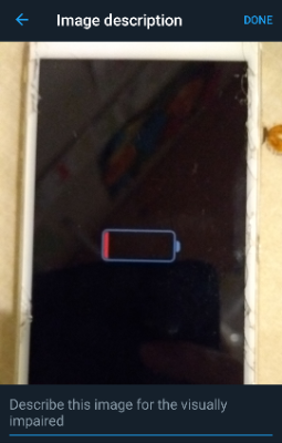
Users of screen readers, for example those with sight problems, can't see a picture whereas they can read this blog post. Their screen reader converts text to speech but it cannot (yet) look at a picture and describe exactly what's in it. By adding the alt attribute to images on a web page, with a text description of the image, the screen reader can read aloud what the image is of. Twitter now allows the inclusion of alt data when uploading images, and explains this is to "describe the image for the visually impaired". Ghost also added support for alt earlier this year so I've been sure to include that information in blog posts ever since.
Good contrast is important too. I run the Twitter app in dark mode (as shown in the screenshot above) and that's fine for me. My wife wouldn't be able to read it (poor contrast for her) so the ability to customise the colours of the interface is important to her. Indeed, some teaching products she's evaluated for work have been rejected purely because she cannot see them.
A person's motor skills are also an important consideration. Someone lacking fine motor control would have an issue clicking a one word link on a web page, yet years ago "to read about the Hackers film, click here" (note the link is only on the word "here") was seen as the best way to do things. Guidance has since changed, encouraging site authors to make more words part of the link (if you want to read about the Hackers film, you can click here) and that assists those with motor control issues.
Mimicry is the sincerest form of flattery
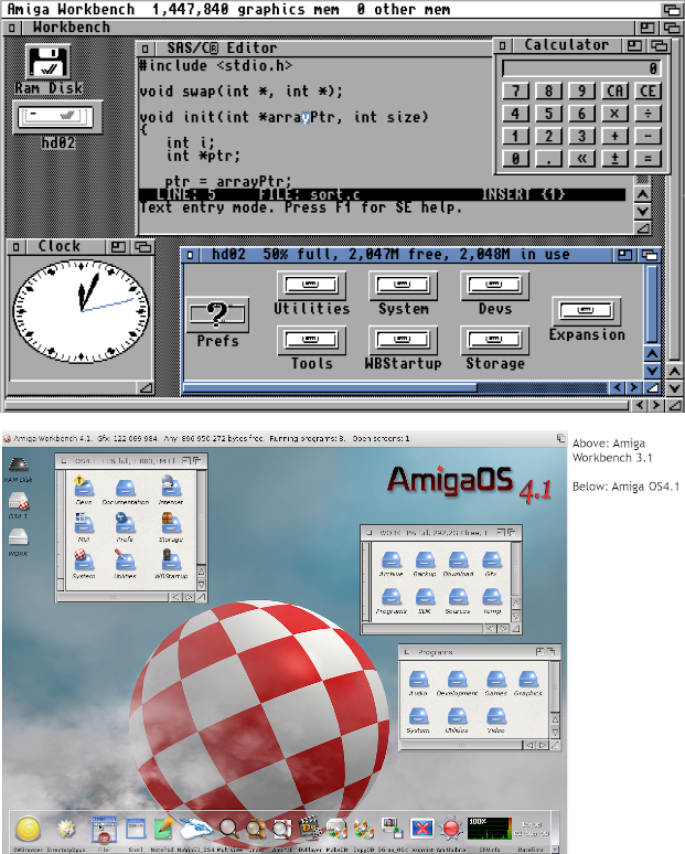
If an interface is good someone's going to copy it. I spent a lot of my early home computing time on an Amiga which meant using the Workbench GUI. Some things I loved, like holding down the right mouse button to get the menu at the top of the screen. Other things, like having to open drawers to launch programs, I found a pain. I quickly found a tool to add a Windows-esque Start menu to Workbench, only to have a friend comment "you hate Windows so much, yet you've made your Amiga look like one". The bottom line though is that Microsoft had come up with a good interface, improved over time with the ability to search by typing what you want rather than searching with your eyes. Amiga OS 4 made a dock (much like the one in Apple's Mac OS) a feature and it was a good move.
Designing interfaces isn't easy, and sometimes a refresh is a good idea (I'd hate to still be using Workbench 3.1, although sometimes I do crave the topaz font). The important thing is to listen to feedback and to make a usable system. While this post has largely been about computer based user interfaces we interface with all sorts of tools every day. If it's difficult, someone will just use something else. Also, it's worth remembering accessibility is a right, not a privilege, so let's not exclude people by making poor decisions.
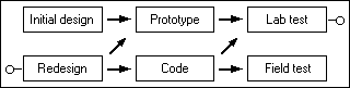
Banner image: the Windows 95 iterative design process, from https://socket3.wordpress.com/2018/02/03/designing-windows-95s-user-interface/