Days 1 - 3: eVitabu dev week (July 2019)
The first few of days of July 2019's eVitabu development week.

Back in February I took a week off work to dedicate to eVitabu development - I got a lot done and you can read about it here. I've taken another week out of the day job to work on the project again.
As always, Geoff and I started with a cuppa to plan the week. After a general catch up, priorities were listed so I could crack on. A lot of the focus will be on fixing bugs and on grading user activity so APF is able to see how users are getting on, how often they use the app (online and offline) and what can be improved.
Quick wins
IMEI gone, and back again
Quite some time ago I added the ability to retrieve the device's IMEI number and show it on the about my device screen inside the eVitabu app. Given our user base is generally running the app on tablets, often without a SIM card, this feature wasn't particularly used. When loading the about my device screen, users would be prompted with a request to allow eVitabu to "make and manage phone calls" which seems extraneous and excessive so I removed that feature.
And then I put it back ...
Android 8 (Oreo) uses the READ_PHONE_STATE permission in order to give access to the device serial number, so the permission was needed either way and IMEI viewing got brought back from the dead. If you're wondering why an eLearning app needs the ability to view the serial number (and IMEI) you're not alone (Geoff asked the same). The feature was added after a number of our users at the launch conference asked for it. On the Lenovo tablets we provided the serial number sticker was printed black on dark grey - not easy to see at all.
Announcement highlights
When eVitabu downloads a new announcement it's highlighted in a pale orange. Sadly this was set to have a width of wrap_content rather than match_parent so the highlight wasn't the full width. This has bugged me for a while, so I spent a few moments sorting it out. Original screenshot below, I won't insult anyone's intelligence by including a photo of what it looks like now!

Scrollable content descriptions
When choosing a resource to download the user can read a description of the content, normally just a short paragraph. This worked fine on 7" tablet screens (the size of the device we issued) but not so well on mobile phones. The dialog providing that info now scrolls, happy days!
CRM integration stopping at 25 records
eVitabu's management application (EVM) integrates with the charity's new CRM, allowing partner data to be viewed. Unfortunately the CRM had only imported 25 records via EVM's API. A quick check showed "pagination" was enabled on the Yii2 dataprovider so this was turned off using 'pagination' => false,:
public function prepareDataProvider(){
         $query = EvmPerson::find();
         $query->where(['!=', 'exclude_sync', '1']);

         $dataProvider = new ActiveDataProvider([
            'query'      => $query,
            'pagination' => false,
         ]);
         return $dataProvider;
}All languages preference
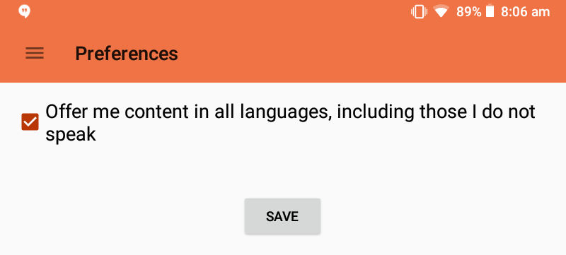
To cut down the amount of data being sent to our partners, which they pay for by the megabyte[1], we decided to only provide details of contributors that published content in languages the user spoke. Where the contributor offered content in a number of languages, only those the user knew would be made available to them. This reduces the user's costs but also speeds up transfer times. Additionally it prevents the accidental downloading of a resource that can't be used (a waste of time, storage and money).

Geoff, the APF projects coordinator (plus my boss and friend), needs to be able to demonstrate eVitabu so wanted the ability to view resources in all languages. By ticking the box he's able to do that, as is any one of our partners (they sometimes operate in pairs, not necessarily both speaking the same languages).
Android app bundles
Android app bundles make it possible to deliver the same app but in a smaller package: Google essentially repackages your app so assets that aren't required by your device don't get included in the download. For example a high resolution tablet doesn't need to download the assets for lower resolution devices. The Play developer console estimates the eVitabu download could be 78.4% smaller if I switch to app bundles, so that's certainly worth doing. My only concern is making sure all eVitabu's features are delivered at install time and not downloaded later (it would be useless if the code to open the content wasn't available).
Initial testing in my alpha testing channel suggests eVitabu for my Motorola G5 is a whole 3.83MB. This is much closer to the original size, and significantly better than the 20MB the app inflated to.
If Thursday and Friday remain as productive as Monday - Wednesday then this will have been a very worthwhile week :) .
Click to read about the end of the week.
Banner image a screenshot from the git commit history. I love the "tubemap" lines.
[1] I appreciate everyone pays by the megabyte, but consider having to buy data in a pay as you go format. Not the cheapest thing to do!

