
Developing eVitabu
Things I learnt while working on eVitabu for African Pastors Fellowship.

Following on from my introduction to eVitabu back in June, I'm going to look at how eVitabu was developed. The project is ongoing with some changes published recently, and more planned soon. Hopefully this post will detail some of the things I've learnt and that it helps others as they embark on projects.
If you want to follow all posts about eVitabu, you can see the eVitabu tag. I'm also marking these with the development tag, which also covers non-eVitabu development posts.
Scope and specification
Having a specification to work to is really beneficial when developing software, or implementing any system. The advantage of a specification is that you can avoid scope creep, where irrelevant tasks get added to the project and cause delays. You can also schedule the work effectively.
The specification for eVitabu was very fluid in that it wasn't overly defined by the client (African Pastors Fellowship, APF). Part of that was because they didn't know exactly what they wanted, although as we progressed some elements and requirements became apparent.
A rigid specification can be limiting to creativity, so part of me is glad APF weren't really strict in their requirements. I certainly gained some experience in guiding a customer around the possible options. That said, at times a little more direction could have been handy.
Continuous dialogue
Obviously it needs to be useful dialog: I'm not talking "hey Geoff, I just commtted some code!". Having a clear and easy path to communicate changes, progress and problems was really helpful. At one point there was a risk we wouldn't be able to deliver the project on time due to some unexpected issues so it was important we could communicate that clearly and promptly. Fortunately the problem was resolved quickly.
We used a mixture of Google Hangouts and email for virtual communication, plus in person meetings. The latter had the advantage that I could sketch what I was thinking, with Geoff and Mike making instant changes. I'm saying predominantly "I" because I'm usually the one with a pen in his hand!
Expect the unexpected
Given how long we'd been working on one design, you'd have thought that would be what we ended up with. The initial design listed all available content and, on a separate screen, all the content you'd downloaded to your device. This was searchable and made sense, even if one big long list didn't look pretty. In hindsight, having a long list was a problem when considering scale but it wasn't scale that prompted the change.
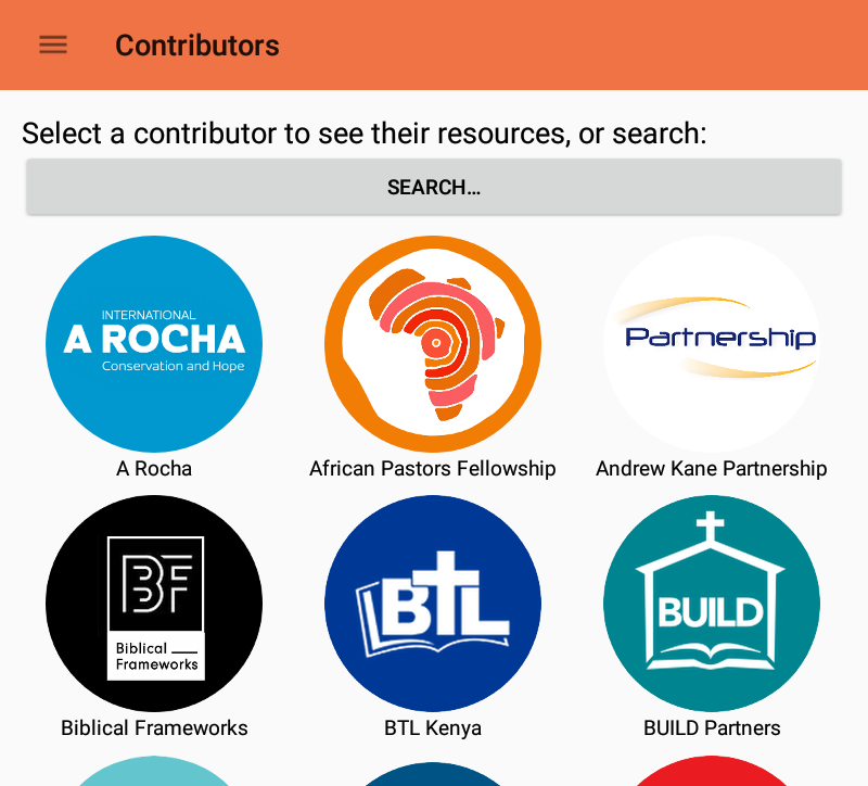
We were having a project meeting when the CEO (Dave) announced the need to change the interface to how it looks now. Whatever the interface looked like it needed to work (the current design did but not nicely) and it would be around for a long time. Some of the pastors using eVitabu we'd only meet once at the conference in March 2018, so the idea of making a major user interface change and pushing the update remotely would have caused massive problems. The new design would present the user a list of contributors and they could tap their logos to browse content.
Looking back at the prototype UI, that big list, it was a big problem. It wasn't nice to use and didn't look particularly special. Dave was right to change the design but it was unexpected. Fortunately it happened early enough in the project that we could accomodate the request. I confess to liking the new design much more than the original.
Functional / unit tests
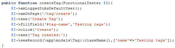
I'd never written a unit test before, and these were something Adam introduced me to while I was working on this project. There are numerous types of unit tests but I focused on functional tests which also meant I avoided the need for Selenium (not that I have anything against it). Yii2 integrates nicely with Codeception so I used that framework to get the job done. An example test is below, and the thing I like most about it is the way it's fairly readable, even to someone new to Codeception.
public function createTag(FunctionalTester $I){
        $I->amLoggedInAsDefaultUser();
        $I->amOnPage('/tag/create');
        $I->see('Create Tag');
        $I->fillField('#tag-name','Testing tags');
        $I->click('Create');
        $I->see('Tag created:');
        $I->seeRecord(\app\models\Tag::className(),['name'=>'Testing tags']);
    }
My tests perform checks such as ensuring content is correctly inserted (or not, when it shouldn't be), validating a user can't create a duplicate entity when they should be unique (e.g. tags) and checking unauthenticated access isn't possible. It was the tests for unauthenticated access that came in to their own when I found an authentication bypass following several test failures.
It turns out I'd not correctly implemented the authentication requirements on some controllers. This meant even though an unauthenticated guest couldn't see menu options (the menu was correctly hidden) they could access parts of the site if they knew the address. There are clear issues with this: an unauthorised person could make changes and changes couldn't be tracked back to a user (which would likely mean the application would fail immediately it tried to update the log).
Needless to say these test results were a shock, as I'd been quite careful (just not careful enough). The problem was solved by marking my BaseController as an abstract class, so I had to implement the relevant methods in each controller that was based on it. Neglecting to implement these methods (the authentication check, for example) results in an error.
I now create tests routinely, and authentication bypass is one of the first test methods I create!
Searching and discoverability
After the user interface change my biggest concern was how the end user would find content. Unless they knew that Christian Aid made resources on family planning, or that Eagles Wings Ministries wrote about children in the church, they wouldn't know to choose those contributors in order to reach that content. Dave knows the end users much better than I do, and assured me the pastors would know who these organisations were based on past associations. Even so, finding content was still a problem.
Quite early on Mike built a search function in to the eVitabu app to help locate content. We also expanded the system to allow resources to be tagged with key words to assist searching. Content could also be placed into series, for example a series on farming or on Advent.
In order to make resources more discoverable, the search field will locate resources based on language, title, series, description or tags. Having language in there allowed us to provide a basic language filter (although there are plans to build that in in more detail). The problem with tags is that a human still has to apply tags to each resource; at our December meeting I found only one sixth of the resources were tagged. While this isn't strictly a development issue, it is an interesting statistic none the less.
Development is ongoing
I'm conscious that development is very much ongoing, the product isn't finished (and may never be). Where eVitabu will go is looking very exciting, and I'll likely blog more about that as it comes up. Needless to say, I feel I'll be involved with this project for a while :) .
Banner image an excerpt from one of eVitabu's functional tests.